When the conversion rate on a Shopify store is bad, most founders’ first instinct is to redesign. New theme, new visuals, new layouts. We’ve watched a lot of D2C brands burn time and money on this. This is a real Shopify conversion rate case study — what we did, why it worked, and what every D2C founder should take from it
In our experience, redesigns rarely fix conversion. Here’s what does.
This is the story of how we moved a jewelry D2C store from 0.7% to 2.4% conversion in a few weeks — without touching the overall design.
The setup
The store was Silvago, a premium silver jewelry brand. We built it from scratch on Shopify — clean theme, mobile-first, fast loading, all the usual boxes ticked.
After launch, we ran ads to drive traffic. The metrics looked promising — CTR was healthy, CPC was reasonable, visitors were actually clicking through to product pages and adding items to cart.
Then they vanished.
People were adding to cart and not checking out. Conversion was sitting at 0.7%. Industry average for jewelry D2C is closer to 1.5–2%. We were below floor.
What we didn't do
We didn’t redesign. We didn’t change the theme. We didn’t add 5 new apps.
Instead, we asked one question: “If we were the customer, what would we be thinking right now?”
We opened the cart page and looked at it like a buyer, not a designer. What we saw was a problem most Shopify stores have — and most founders never notice.
The cart had no reason to convert.
It had a list of items, a checkout button, and that was it. There was no urgency. No reassurance. No reason to act now instead of later. A buyer reaching the cart was essentially being asked to commit money on faith — and walking away.
What we changed
We made several small, targeted changes to the cart and product page over the following weeks. None of them required redesigning anything.

1. Scarcity — “Only X items left”
We added real-time stock indicators on the cart and product page. When inventory was low, the buyer saw it. This isn’t fake urgency — these were real stock levels. But surfacing them changed the buyer’s mental math from “I’ll come back later” to “I should grab this now.”
2. Trust signals on the cart
We added three signals that mattered specifically for jewelry buyers:
- “2000+ customers love this” — social proof, because jewelry is an emotional purchase and buyers want to know others took the leap
- “Pure 925 silver” — a quality marker, because cheap silver is a real concern in this category
- “Free delivery + COD available” — risk reversal, because Indian buyers want to avoid prepaid commitment when they can
3. The product page review insight (this one surprised us)
Using Microsoft Clarity, we watched dozens of real visitor recordings. We noticed something we didn’t expect: after viewing the main product images at the top, visitors immediately scrolled down to the reviews section.
Not for the text reviews. For the customer-uploaded photos.
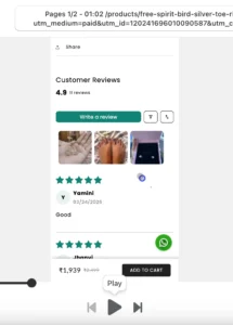
Buyers wanted to see the jewelry on real people, not on the polished product photos. The product photos at the top were beautiful but felt like ads. The customer photos in reviews felt like proof.
We restructured the product page to bring real customer photos higher up, integrated them with the main gallery, and made them more prominent. This single change had outsized impact.
4. Iterative cart testing
We didn’t get the cart right in one go. We tested layouts, tweaked copy, repositioned trust badges, A/B tested button text. Every test taught us something. Most changes were small. The compound effect was significant.
The result
Within a week of starting these changes, conversion lifted noticeably. Over the following weeks of continued optimization, it stabilized at 2.4% — a 3.4x improvement over launch.
No redesign. No new theme. No expensive overhaul.
Just close attention to what visitors were actually doing, and targeted changes based on what we saw.
The bigger lesson
We’ve worked with D2C brands who’ve spent lakhs on redesigns hoping conversion will improve. Most of the time, it doesn’t.
The store usually isn’t the problem. The store doesn’t know what the buyer is hesitating about. Only watching the buyer can tell you that.
If you’re running a Shopify store and conversion isn’t where you want it, before you redesign — install Microsoft Clarity (it’s free), watch 20 visitor recordings, and ask yourself: where is the hesitation? What’s missing? What would I want to see if I were them?
Most of the time, the answer isn’t a new design. It’s a few specific changes the current store is missing.
Thinking about your Shopify conversion?
If you’re running a Shopify store and conversion isn’t where you want it, we can help. We do free 30-minute audits where we walk through your store and tell you exactly what we’d change — whether you hire us or not.
Book a Strategy Call →